Adding Credibility: Creating Custom Content in R - ggplots
This article is the first in a multipart part series on creating custom content using R. Full code will be made available on Github.
Consistency and clarity lead to credibility. This is true not only in how you speak with clients, but also in what you present to them. The Microsoft Office Suite is great but limited. True custom solutions are code-based and scale to your specific needs.
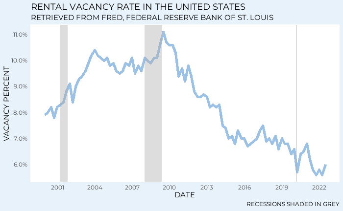
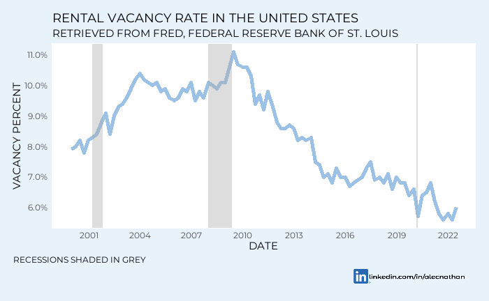
In my experience, the R language and the RStudio IDE have been phenomenal tools for generating flexible content. This article will walk you through how I created the below chart. This chart, on rental vacancies, is used in our inaugural article, SFR Investment and Economic Uncertainty.
For more information on R and RStudio, Matt Dancho’s Business Science University provides phenomenal resources. In addition, my colleague and mentor Jonathan Regenstein has written extensively on financial analysis in R.
First thing first, we need data to work with. For free macroeconomic data, there are two primary sources, the US Census and the Federal Reserve Bank of St Louis. Fortunately for us, both of these institutions are easily accessible in R through the tidycensus and fredr packages.
Note: both of these packages require API keys. These keys are provided when you set up free accounts with FRED and the Census Bureau. This process is detailed in the third article in this series.
The above chart is sourced from the Federal Reserve Bank of St Louis’ Federal Reserve Economic Data (FRED) website. The table, Rental Vacancy in the United States, is accessible via the fredr_series_observations function within the fredr package. This function simply takes the displayed data and makes it available in your RStudio environment. The series_id, RRVRUSQ156N is in parentheses next to the chart’s title.
Using the fredr_series_observations function, we pull in the date and value columns. This is filtered to all observations after January 1, 2000. With tidyverse conventions we pipe our data into a ggplot2 object with a geom_line layer. This gives us the simplest possible version of a chart.
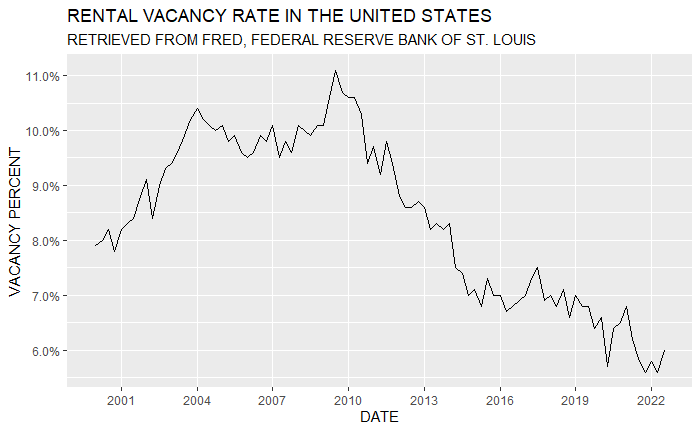
Let’s take note of a few things. The values coming in from FRED, which we know to represent a percentage, are expressed as numbers. Our x axis, representing the observation date, defaults to date_breaks of five years. The line itself is grey, as is the background. The names on our axes correspond with the column names in our dataframe, and the chart has no title or caption describing what we are looking at. Though this chart is factually correct, a user has no idea what they are supposed to take away from the data.
An easy first step would be to name and reformat our axes. At least then the scaling will make sense. Ggplot2 has phenomenal functionality around axes. The family of scale_ functions will serve us well. For this particular example we will use scale_x_date and scale_y_continuous. For our x axis, we want the axis name in all caps and we want the date_breaks to be every three years. Additionally, we want to get rid of the minor_breaks. For the y axis we want to go back to our dataframe and divide our value by 100 to convert to the appropriate scale. Finally, we want to name the axis vacancy percent in all caps and convert the numbers to percentage format using the scales package.
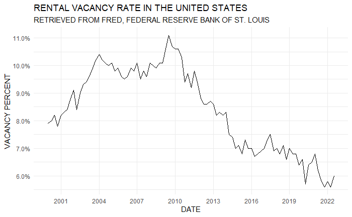
This chart is starting to come together. Next, let’s add a title. From here we can get into some of the more complex manipulations. Again, the ggplot2 package does most of the heavy lifting. The ggtitle function allows us to specify both a title (label) and a subtitle.
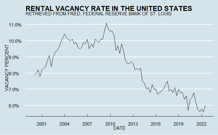
For purely academic purposes, or for a printout in black and white, the chart above is not bad. With just these few lines of code you can create a legible chart. However, we are looking to tell a story. Stories require consistency and stories require themes. In fact, ggplot2 and the accompanying ggthemes packages come with pre-built themes that may look familiar. The examples below apply the theme_fivethirtyeight and theme_economist functions to replicate the aesthetics of ESPN’s fivethirtyeight and the Economist magazine.
These themes are sleek and great in a pinch, but represent someone else’s brand. What we want is to define our own brand. If you look under the hood of the ggplot2 package, the themes function contains innumerable specifications. Learning and mastering the arguments within this function is the key to unlock the full power of ggplot2.
Our goal, the first chart in this article, actually doesn’t require all that much. However, we do want to start with a blank canvas. We must quickly pass the theme_minimal function through our object to remove background color and a few other unnecessary embellishments.
We need to color our line. The coloring should be consistent with other assets you put out, including but not limited to your website, business cards, Excel docs, and any advertising. At Riverside, many of our clients require analysis in Excel spreadsheets. As this is the case, we use a color native to Excel, #9BC2E6. This light blue is named Blue, Accent 5, 40% Lighter within Microsoft Excel. Choose a color that suits your needs and stick with it.
Since the line is now a lighter color, it needs to be thicker to pop off the page. Within geom_line we can specify the linewidth and color. Note that this is done within geom_line and not theme.
Now we’re getting somewhere. Let’s apply our theme function. We will need to revisit this when we add a logo and change the font, but let’s stick with the basics for now. We’re going to use the following arguments: panel.grid, panel.background, panel.border, and plot.background. Your panel is the area directly behind your chart, while your plot is the entire surface within the object.
For the sake of our vacancy rate analysis, we don’t really need gridlines. I abide by the principle that less is more, so let’s remove our gridlines. To do so, we must make our panel background and panel grid the same color. In this case we use white. To make the chart pop we adjust our plot background color. We use another shade of blue, #E8F2FA, that is a little lighter than our geom_line.
At this point, given the simplicity of the chart, it is important to provide some macroeconomic context. The unmatched Jonathan Regenstein, mentioned above, has created a function to shade recessionary periods on ggplot2 objects. This function is contained within the code for this article. Jonathan’s Github also provides many resources for your code. We add a caption using the labs function to let users know what the grey shading means.
The final steps, adding a logo and changing our font, take more than just proficiency in R. The solutions below may require fine-tuning. First, let’s change our font. You may want to build your brand using a Google Sites website. Google Sites has Montserrat, a sans-serif font built in. I like this font and want to use it for this example, but Montserrat is not native to my laptop. We must use a few more packages to make all of this work.
Load the sysfonts and grDevices packages into your R session. Sysfonts allows you to access fonts from Google using the font_add_google function. Be sure to specify both the font family and name. To pass this onto our GGPlot2 object we use the text argument within the theme function.
All we have left to do is reposition our caption and place the logo. Ggplot2 has a native function that gets us most of the way there, annotation_custom. This allows us to place a logo in a specified location, provided the logo file is saved in our local environment. We will use a custom get_png function to do so. This function depends on the graphics and png packages.
Note: Save your logo as a .png file. PNGs can have transparent backgrounds which will integrate with our formatting.
Our annotation_custom function requires us to specify where, on the panel, our annotation is to appear. To do this we need to be cognizant of our axis ranges. In this case, we want our logo to appear beneath our chart on the right side. To get this to the right, we specify our range of x values to be between 7/1/2016 and 12/31/2022. To keep this beneath our chart, we give our annotation an acceptable y range between 2.5 and 5%.
You may be wondering how we get a value to display outside the range of our panel. Ggplot2 has a solution for that. The coord_cartesian function gives us direct control over the acceptable range of values. Within this function we set the clip argument to off.
Additionally, we don’t want part of our logo cropped out of the broader plot area. We must expand our plot.margin within our theme function. Put simply, the margin controls the padding around the panel. It takes a vector of numbers representing the top, right, bottom, and left of the panel. We want to expand beneath the panel so we modify the third value in our vector.
When we position our logo, it is conspicuously on top of our caption, “recessions shaded in grey.” We can move this to the bottom left, also using our theme function. The plot.caption.position argument allows us to specify the caption’s location in reference to the chart itself by positioning the caption relative to the plot. From here we locate the plot.caption with no horizontal adjustments. Finally, we arrive at our result.
Much of this is repeatable, and we will explore functional programming and custom themes later in this series. In general, the annotation_custom component of your theme will require fine-tuning based on the values in your axes. This is just scratching the surface. Ggplot2 is a phenomenal tool for branding your content.
Alec A. Nathan is the Director of Research and Data Analytics at Sylvan Road Capital. A graduate of the University of Georgia, Alec specializes in real estate investment and data science. Please direct any inquiries to anathan@sylvanroad.com.


